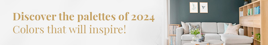
In the changing world of interior design, colors play a crucial role in creating environments that reflect the emotions, personalities and aspirations of those who inhabit the spaces. As we move into 2024, paint color trends are leaning toward palettes that promote sustainability, calm and connection to nature, while embracing vibrant, expressive hues to inject energy and creativity into our homes and workplaces.
This year, color trends take us on a journey from reconnecting with nature and seeking inner peace to boldly expressing our individuality. Earthy colors and serene greens reconnect us with the outdoors, soft neutrals and pastels offer a calming refuge, while vibrant and saturated colors inject vibrancy and dynamism into our spaces. Classics such as deep blues and sophisticated grays provide a safe and elegant foundation, allowing for bold combinations and contrasts.
In the changing world of interior design, colors play a crucial role in creating environments that reflect the emotions, personalities and aspirations of those who inhabit the spaces. As we move into 2024, paint color trends are leaning toward palettes that promote sustainability, calm and connection to nature, while embracing vibrant, expressive hues to inject energy and creativity into our homes and workplaces. In this article, we explore the most relevant paint color trends for this year, providing a comprehensive guide for those looking to refresh their spaces with the latest in interior design.
Back to Nature: Earthy and Green Tones
In an increasingly urbanized and technologically dependent world, there is a strong trend towards reconnecting with the fundamental elements of nature. This trend is clearly reflected in the color palettes for 2024, where earthy and green tones occupy a predominant place, inviting calm, reflection and, above all, sustainability in our living spaces.
Sustainability and Connection
The growing concern for the environment and the desire for more sustainable spaces are manifested in the choice of colors inspired by nature. Earthy tones such as ochres, soft beiges, and warm browns evoke a sense of stability and tranquility, connecting us to the outdoors in a subtle yet profound way. These colors not only look good, but also promote an atmosphere of serenity and peace.
On the other hand, greens, from soft and muted to more vibrant and saturated, are reminiscent of greenery and the outdoors, creating spaces full of life and positive energy. Light greens and sage tones, in particular, are perfect for those seeking a quiet refuge in their homes, offering a visual respite that invites relaxation and disconnection.
Nature-Inspired Shades
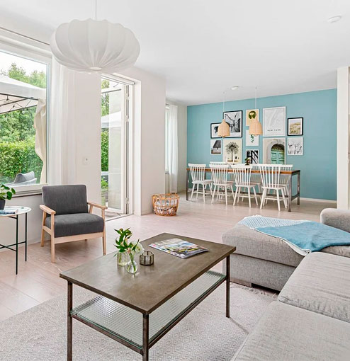
The nature-inspired color palette for 2024 extends beyond traditional browns and greens, incorporating shades such as sky blue, terracotta, and mustard yellow. These colors, inspired by natural elements such as the sky, earth, and sun, bring warmth and luminosity to spaces, creating welcoming environments that foster well-being and positivity.
The integration of these colors in interior design is not limited to walls. It extends to accessories, textiles and furniture, allowing for a more complete and enveloping experience. Combining these tones with natural materials such as wood, linen and cotton further enhances the connection with the natural environment, reinforcing the feeling of authenticity and comfort.
Emotional Impact
Colors inspired by nature have a profound emotional impact on people. They have been shown to reduce stress, improve mood and increase the overall sense of well-being. By incorporating these tones into our spaces, we are inviting calm and balance into our daily lives, creating an environment that is not only aesthetically pleasing but also beneficial to our mental and emotional health.
Warm Minimalism: Soft Neutrals and Pastels
In the search for spaces that radiate tranquility and harmony, warm minimalism is positioned as one of the most welcoming and comforting trends for this year. Moving away from the coldness that can sometimes accompany traditional minimalism, this trend leans towards a palette of soft neutrals and pastel tones, creating serene environments that invite rest and relaxation.
Subtle Elegance
The elegance of this trend lies not in ostentation, but in subtlety and the ability of colors to blend into one another, creating an uninterrupted visual flow that visually enlarges the space. Soft neutrals such as off-white, light gray, and beige provide a calm, luminous base, while touches of pastel shades such as pale pink, sky blue, and mint green add delicate interest and a touch of color that revitalizes without overpowering.
Palettes that Promote Tranquility
These colors are not random; they are meticulously selected to promote tranquility and well-being. Color psychology tells us that pastels and neutrals have a calming effect on the mind, helping to reduce stress and promote a sense of peace. In a world where the pace of life is increasingly fast-paced, our homes and workspaces become personal sanctuaries, and the choice of these colors helps to create that personal refuge.
Warm minimalism is characterized by simplicity, but also by warmth and an invitation to live more consciously and focused on what truly matters. Decoration is kept to a minimum, with a preference for quality over quantity and great attention to detail and texture. Natural materials such as wood, linen, and ceramics perfectly complement this palette, adding depth and a tactile connection to the environment.
Chromatic Boldness: Vibrant and Saturated Colors
In the spectrum of interior design, chromatic boldness manifests itself through the bold incorporation of vibrant and saturated colors. This trend is a celebration of energy, vitality and boldness, defying convention and transforming spaces into vivid expressions of personality and creativity. Far from settling for the traditional, chromatic boldness invites experimentation with unexpected palettes, turning every room into a work of art.
Spaces full of Energy
Vibrant, saturated colors have the power to significantly alter the perception of a space, adding depth, dynamism and a sense of adventure. Intense reds, electric blues, emerald greens and solar yellows take center stage, capable of infusing energy and optimism. These bold hues are perfect for those who wish to make a statement and reflect their jovial and energetic spirit through their surroundings.
Using Color to Define Spaces
The trend toward vibrant, saturated colors is not limited to wall paint; it extends to furniture, accessories, and artwork, allowing for deep personalization of spaces. Each element is selected for its ability to add character and define the desired mood. For example, an emerald green velvet sofa can become the focal point of a living room, while a set of dining chairs in vibrant hues can instantly revitalize a traditionally subdued space.
